#28670 [YT [Flutter][Wording](5/13)SUG-Layout bug: The text display is incomplete, and the font sizes are inconsistent. DE4-331307]
AI Suggestions
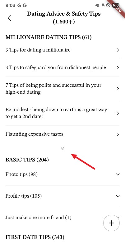
#1
低风险 Reposition or remove the orphaned downward chevron icon located in the whitespace between 'Flaunting expensive tastes' and 'BASIC TIPS (204)'
A misplaced chevron icon floating in whitespace looks like a rendering bug and breaks the consistent right-aligned indicator pattern used by other rows.
#2
中风险 Change '7 Tips of being polite' to '7 Tips for being polite' in the third list item under Millionaire Dating Tips
Using the correct preposition improves readability and content quality for users.